
Tips & Best Practices for Links & Call-to-Actions
Design call-to-action buttons and links with strategic placement and compelling copy to increase conversion rates and drive qualified traffic
Effective Link-outs and Call-to-Action Buttons: How to Drive Potential Customers to Your Website
Rapidmail
Email Marketing
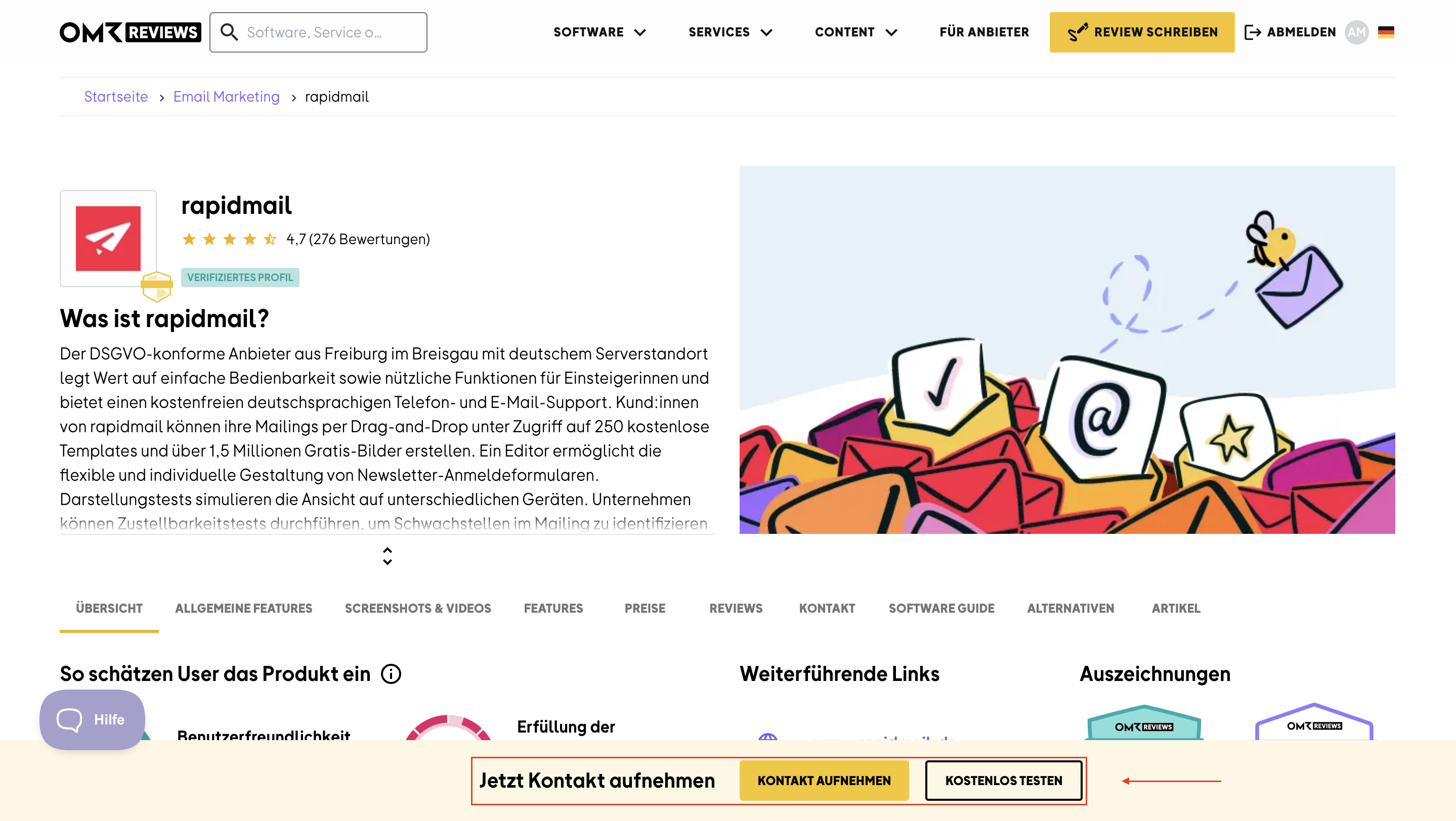
In our article about Links & CTAs, we talked about custom call-to-action buttons. Here are some great best practices for designing them to boost your conversion rate.
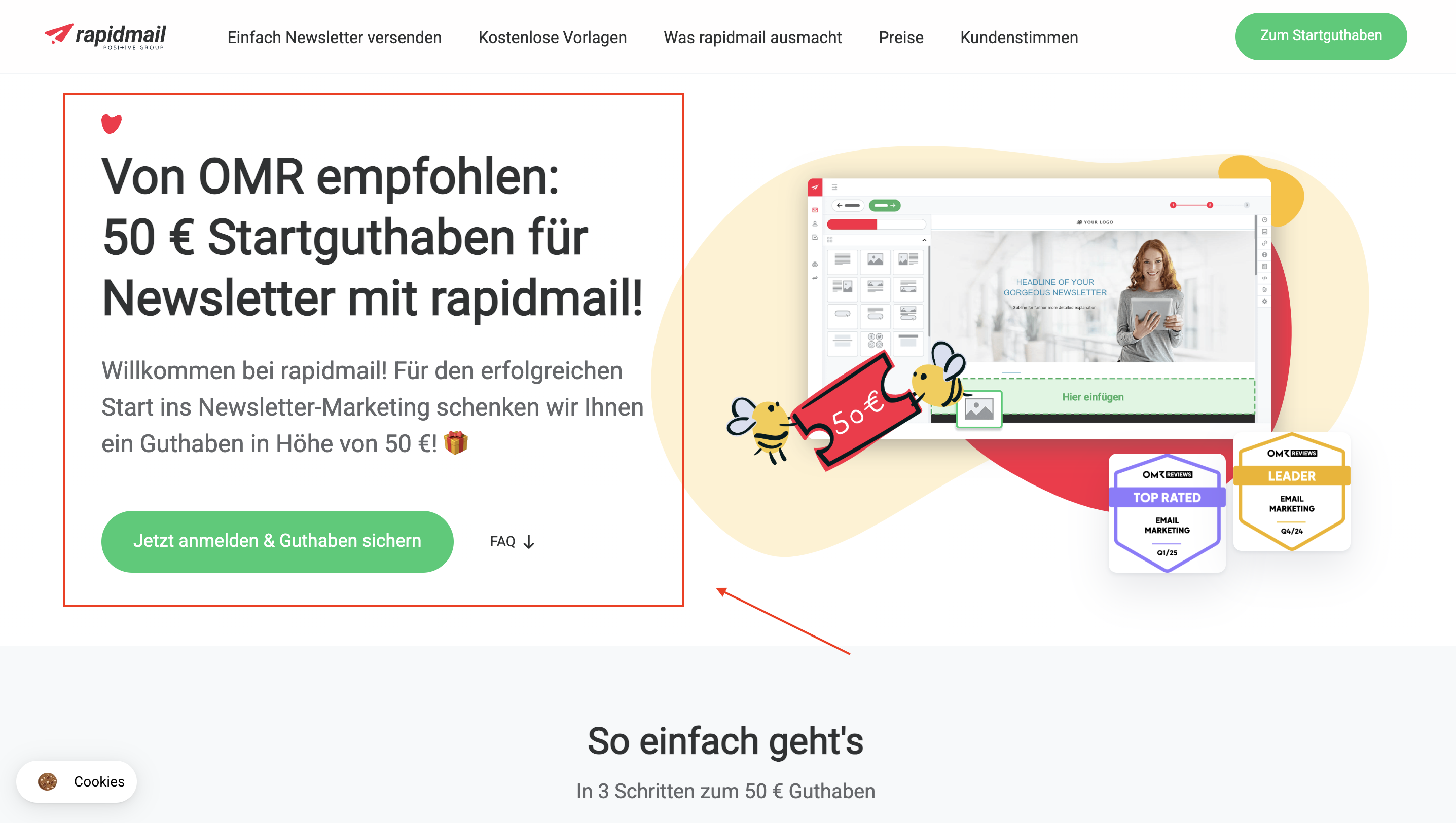
A great example is the CTA button and landing page from Rapidmail. To give users an extra incentive to sign up, the newsletter marketing tool offers a 50 euro newsletter starter credit - an exclusive offer for users who discover the tool through the OMR Reviews profile page.
Crewmeister
Time Tracking
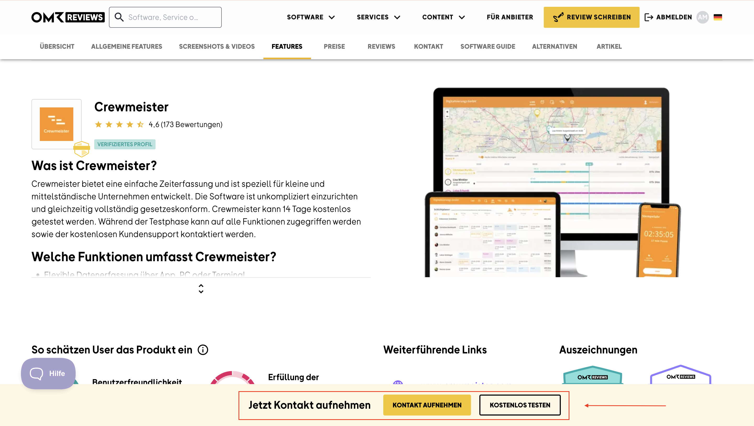
Another great example of a well-designed landing page is Crewmeister.
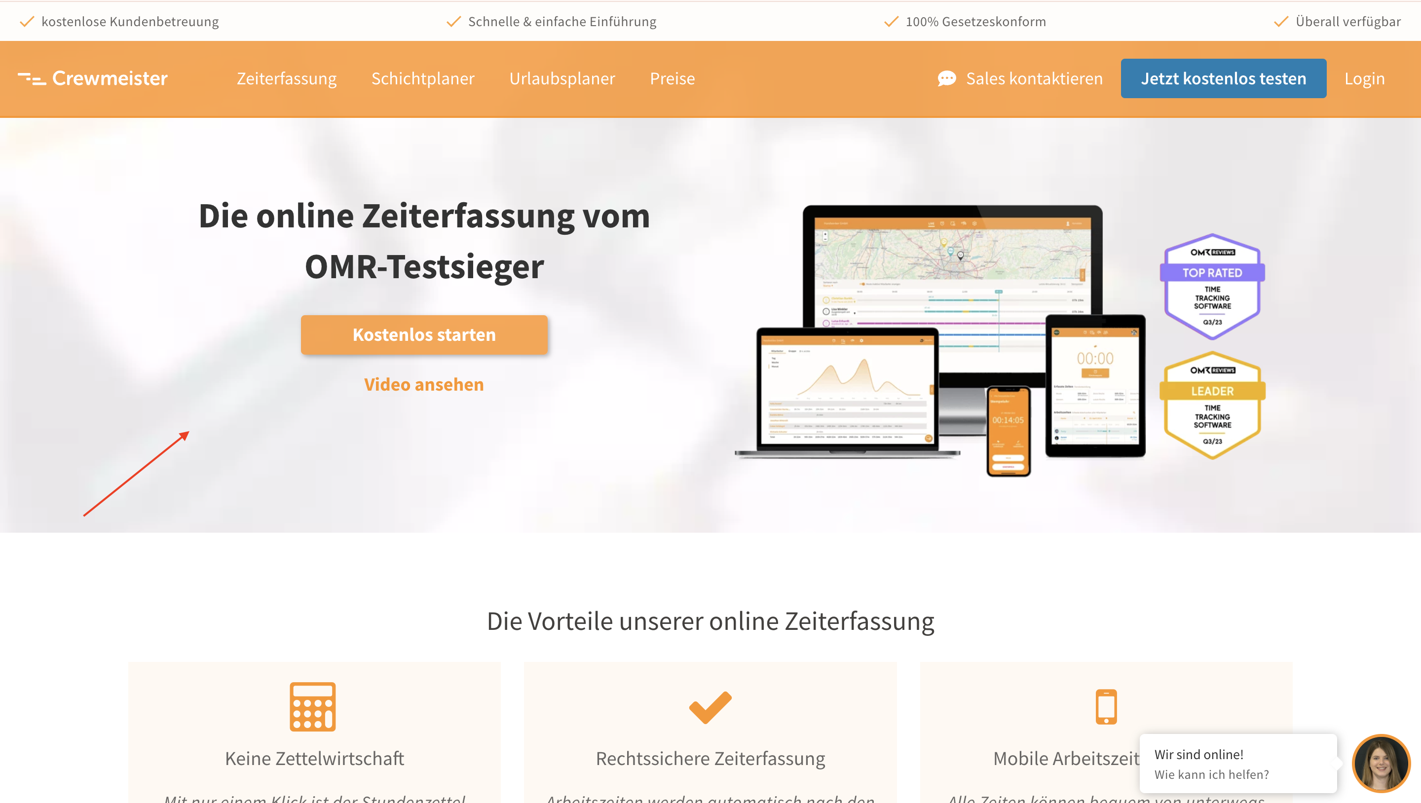
Crewmeister builds credibility by displaying OMR Reviews badges. Important buttons like "Start for Free" are prominently placed so users are directly prompted to take action.
4ALLPORTAL
Product Information Management (PIM)
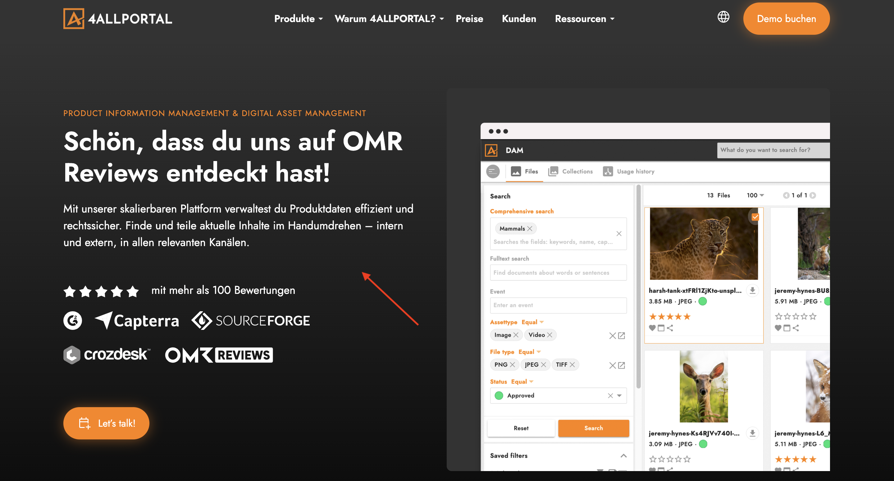
4ALLPORTAL took a similar approach - they created a dedicated landing page for OMR Reviews users and strategically highlighted their reviews there.
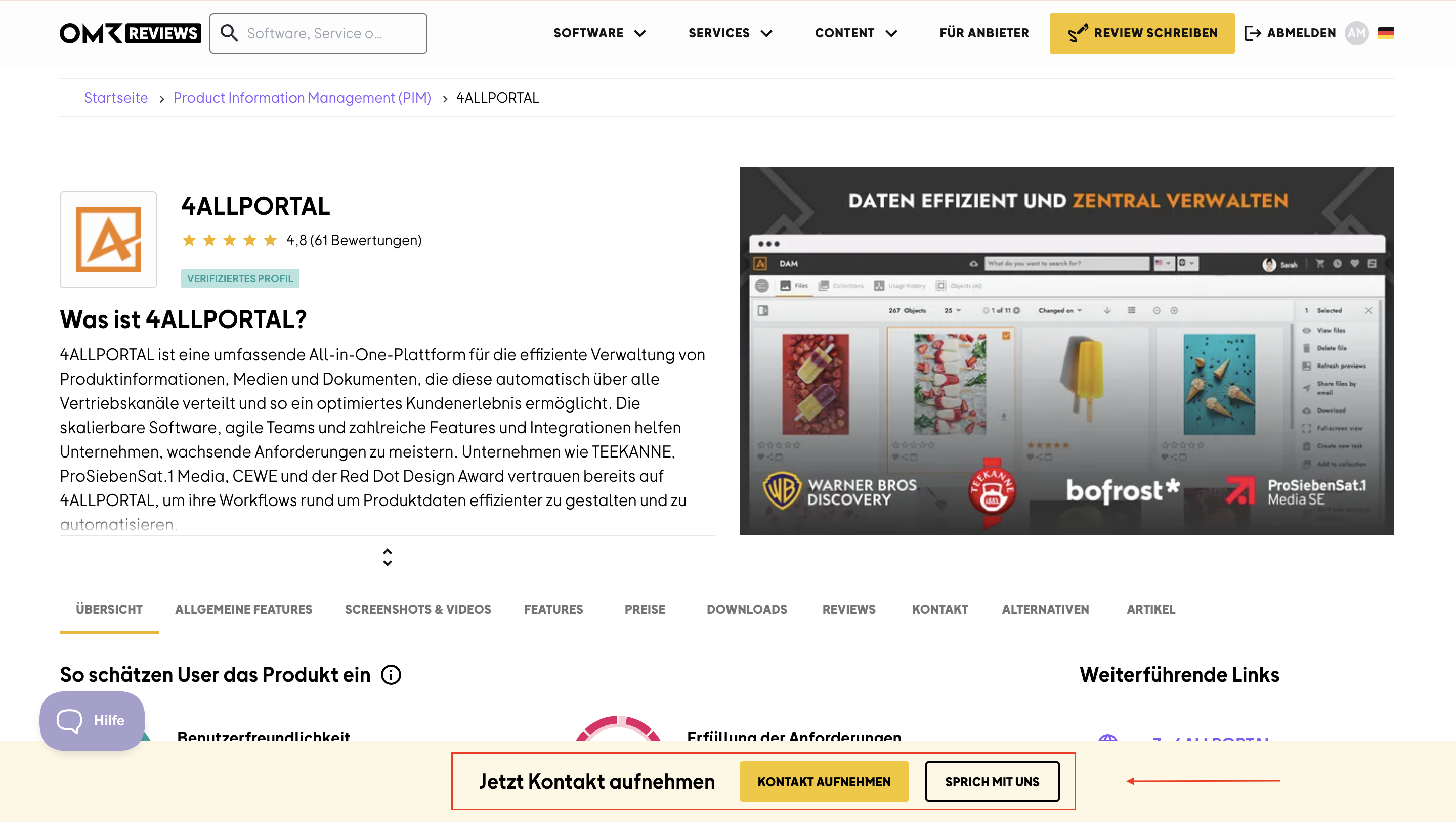
Plus, they focus on direct communication. Their CTA reads "Talk to us" - clicking the button takes users to a landing page where they can schedule a personalized meeting right away. This way, interested prospects are personally engaged and addressed.
 Powered by happysupport.ai